Showing posts with label Fall 2012 interior design. Show all posts

11/2/12

Anthropometrics


Anthropometrics"Anthropometrics" refers to measurements of humans. .
These measurements are usually made of a particular sample of the population, and often separated on the basis of sex and age. Typical anthropometric measurements include standing stature, weight, distance between eyes, and circumference around waist. However, sensory abilities may also be measured, such as hearing ability, sight, and the ability to sense touch.
Anthropometric dimensions website

Ergonomics, or Human Factors Engineering


has been defined as
“… the practice of designing products so that users can perform required use, operation, service, and supportive tasks with a minimum of stress and maximum of efficiency.”
Woodson, W. (1981). Human Factors Desi
gn Handbook. McGraw Hill 1981.

9/28/12

40 Guidelines of kitchen planning

 NKBA National Kitchen and Bath Association

1a.    Doorways at least 32" wide and not more than 24" deep in the direction of travel.
1b.    Walkways at least 36" wide.
1c.    Work aisles at least 42" wide for one-cook, at least 48" wide in multi-cook kitchens.
2.    Work triangle 26' or less, with no single leg shorter than 4' nor longer than 9'.
3.    No major traffic patterns should cross through the work triangle.
4.    No entry, appliance or cabinet doors should interfere with one another.
5.    In seating area, 36" of clearance from counter/table edge to wall/obstruction if no traffic passes behind seated diners. 65" clearance for walkway behind seated diners.
6.    Kitchens under 150 sq. ft.: 144" of wall cabinet frontage with cabinets at least 12" deep, 30" high with adjustable shelving. Kitchen over 150 sq. ft.: 186" wall cabinet frontage, with cabinets at least 12" deep, 30" high with adjustable shelving.
7.    At least 60" of wall cabinet frontage with cabinets at least 12" deep, 30" high, included within 72" of the primary sink centerline.
8.    Kitchens under 150 sq. ft.: 156" base cabinet frontage with cabinets at least 21" deep. Kitchens over 150 sq. ft.: 192" base cabinet frontage with cabinets at least 21" deep.
9.    Kitchens under 150 sq. ft.: at least 120" of drawer or roll-out shelf frontage. Kitchens over 150 sq. ft.: at least 165" of drawer or roll-out shelf frontage.
10.    At least five storage/organizing items located between 15" - 48" above the finished floor.
11.    At least one functional corner storage unit should be included.
12.    At least two waste receptacles should be included in the plan: one for garbage and one for recyclables.
13.    Knee space should be planned below or adjacent to sinks, cooktops, ranges and ovens. This space should be a minimum of 27" high by 30" wide by 19" deep.
14.    Clear floor space of 30" x 48" should be provided at the sink, dishwasher, cooktop, oven and refrigerator.
15.    A minimum of 21" clear floor space should be allowed between the edge of the dishwasher and any object which is placed at a right angle to the dishwasher.
16.    The edge of the primary dishwasher should be within 36" of the edge of one sink.
17.    The primary sink should be located between or across from the cooking surface, preparation area or refrigerator.
18.    At least 24" clearance between cooking surface and a protected surface above; or 30" clearance between cooking surface and an unprotected surface above.
19.    All major appliances used for surface cooking should have a ventilation system, with a fan rated at minimum of 150 CFM.
20.    Cooking surface not placed below an operable window unless window is 3" or more behind the appliance and more than 24" above it.
21.    Microwave ovens placed so bottom is 24" to 48" above the floor.
22.    At least two work counter heights: one at 28"-36" above the floor; and one at 36"-45" above the floor.
23.    Kitchens under 150 sq. ft.: at least 132" of usable counter frontage. Kitchens over 150 sq. ft.: at least 198" of usable counter frontage.
24.    At least 24" counter frontage to one side of the primary sink and 18" on the other side. The 24" must be at the same height as the sink.
25.    At least 3" countertop frontage on one side of secondary sink, 18" on the other side.
The 18" must be at the same height as the sink.
26.    At least 15" of landing space, minimum 16" deep, above, below or adjacent to
microwave oven.
27.    Open-ended kitchen: at least 9" counter space on one side of cooking surface and
15" on the other, at the same height as the appliance. Enclosed kitchen: at least 3" of clearance space at an end wall protected by flame retardant material; 15" on the other side at the same counter height as the appliance.
28.    At least 15" counter space on the latch side of the refrigerator or on either side of a side-by-side; or at least 15" counter space no more than 48" across from refrigerator.
29.    At least 15" of landing space, minimum 16" deep, next to or above oven if it opens into a primary traffic pattern. If it does not open into traffic, 15" x 16" landing space needed.
30.    36" continuous countertop at least 16" deep for the preparation center. This center should be immediately next to a water source.
31.    For two adjacent work centers, determine a minimum counter frontage: longest of the two required counter lengths and adding 12".
32.    No two primary work center separated by a full-height, full-depth tall tower configuration.
33.    Minimum clearances for seating areas:a. b. c.
30" high table/counter: 30" w x 19" d table/counter for each seated diner with 19" clear knee space. 36" high counter: 24" w x 15" d counter space for each seated diner with 15" clear knee space.
42" high counter: 24" w x 12" d counter space for each seated diner with 12" of clear
knee space.
34.    Open counter corners should be clipped or radiused; eliminate sharp corners.
35.    Controls, handles and door/drawer pulls operational with one hand.
36.    Wall-mounted room controls 15" - 48" above the finished floor.
37.    Ground fault circuit interrupters specified on all receptacles within the kitchen.
38.    Fire extinguisher visibly located in the kitchen, away from cooking equipment and 15"- 48" above floor.
39.    Window/skylight area equals at least 10% of total square footage of kitchen or total living space which includes the kitchen.
40.    Every work surface in the kitchen should be well illuminated by appropriate task and/or general lighting.

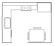
typical examples of floor plans


Things to note:
all solid walls are poche'd , or solid
please note how windows are drawn
all doors swing into a room towards the wall
all rooms should be labeled
line hierarchy.....
solid walls/permanent items have darkest lines
mill work, cabinets, doors a draw a bit lighter, with
the lightest lines being movables furniture etc.
dashed lines represent items above counter top height
(example cabinet above, items on ceiling)

9/21/12

space planning


elevations


Interior Design - how big is......


Bathrooms

stand up shower 36"X36" minimum
tub 30"X60" minimum
sink 16" from wall X 18" wide
toilet 27" from wall X 19" wide

Kitchen
dishwasher 24"X24"
cook top 40"X24"
oven 21"X24"
refrigerator - freezer on top -32"X21"
side by side - 36" X33"
side by side counter depth - 72" X24"

washer 27"X30"
dryer27"X29"

closet depth 24"-36" deep
cabinets are dimension increments of 3"
counter depth from wall 24", height is 30"
working counter height 36"-42" transaction height
48" clear space dimension between adjacent counters
18" minimum from under cabinet from counter surface
maximum reaching height over counter to above cabinet 72"max.

mattress sizes
twin 39"X 80"
double 54" X 80"
queen 60" X 80"
king 78" X 80"

basic drafting


kitchens
island

 
u shape
 
eat in 
 
galley kitchen
 kitchen triangle
typical layout and dimensions
 
appliances
washer and dryer
 
refrigerators

ovens
 cabinet sizes and elevations


LETTERING
PLEASE PRINT, AND HAND LETTER.


9/14/12

Interior Design - Assignment #2

Procure images of Architecture, Interiors, Art, or "Things" that convey the elements, and principles of design. You will record, and label your findings in your sketch book. You should be prepared to share your findings with the class.
Please read the text below, which shows images, and defines the elements and principles.

Due: September 21.

Principles of design
are the laws of designing anything! In other words, to have a good design, you should consider these principles for the best design possible. Elements of design on the other hand are things that are involved within making a design. The major difference between principles and elements is that principles are rules you have to follow and elements are things that will help you complete those rules for the best project outcome.

Principles of Design, as said before, are the laws of designing anything! When making a design the seven principles are contrast, emphasis, balance, unity, pattern, movement, and rhythm. Consider each of these carefully for any design and you'll be a guaranteed a great project!


Contrast means showing differences in two different sections of the design or showing somehow that the design being created is very different from other designs because of its contrast. Contrast can also be used to show emphasis in any part of the design.


Emphasis is given to an area within the design because that area is meant to be seen or is more important to be noticed when compared to other places of the design. For example, your design might be to have white parallel lines going up and down. In the center of this design, you could have a circle. This circle would be a part on the design that is emphasized.


symmetrical

asymmetrical
Balance means keeping your design like a pattern. A balanced pattern would be if you had a border on your pattern in black. Unbalanced would be if approximately one-third of the border was orange and the other two-thirds in pink. To keep your design balanced, make your measurements as accurate as possible. Keeping your design symmetric is a good technique for good balance, but not necessarily the best for all types of designs.


Unity means keeping your design in a sort of harmony in which all sections of the pattern make other sections feel complete. Unity helps the design to be seen as one design instead of randomness all around your design.


Pattern is simply keeping your design in a certain format. For example, you could plan to have wavey lines all around your design as a pattern, but then you must continue those wavey lines throughout the design for good patterns. It wouldn't look good if suddenly you stopped all the wavey lines and drew a picture of a dog.

Movement is the suggestion or illusion of motion in a painting, sculpture, or design. For example, circles going diagonally up and down from right to left could show that the design moves up and to the right or down and to the left.

Rhythm - Repetition is the movement or variation characterized by the regular recurrence or alternation of different quantities or conditions. In simpler words, it's just like pattern and shows that the design has a 'beat' or 'flow' going with it. A plain white box has almost no rhythm what so ever.


Elements of Design, as said before, are things that are involved within making a design. The seven elements of design are color, value, texture, shape, form, space, and line. Elements of design will help your design look a lot more unique from other designs, and can help make the design symbolize anything!

Color is an easy one. Just make sure your designs color is right for the mood! Also make sure that each section's color matches another section's color. Colors is probably the biggest element to pay attention to.

Value is the relative darkness or lightness of a color. Just as said in the paragraph above, make sure the colors you put on your design are dark or light enough for the proper mood. If you want to show a sad figure in your design, most people would give the design a darker value. On the other hand to show happy children playing around most people would recommend lighter colors.

Texture helps your design to be distinctive or have identifying character and characteristics. With the proper texture, your design will look more fascinating than the average design.


Shape is something distinguished from its surroundings by its outline within your design. You can make your whole work a certain shape besides the common square, and then have shapes within the design shape. This makes the design more complex.

Form is similar to the idea of shape. Form is the structure of your design and how everything in the design looks like it's meant to go together. If the form is well planned and then carried out, it almost guarantees your design in black and white will be a success.

Space has to be included in your design. Space means leaving some blank areas. Why would you wanna leave parts of the design blank? Sometimes a humans eye needs space to feel comfortable, and space will let the humans eye distinguish the part that's meant to be noticed compared to just the background. Sometimes not including space in your design is ok, but make sure it doesn't make it look messy.

Line defines the position and direction of the design. If you have lines or shapes that seem to be running horizontally, then the design would seem like it's running in a left and right line. Make sure your design identifies some sort of line so that the human eye can recognize which side is the top of the design or on which side the design is suppose to start with interest.