


 | Ambient lighting provides an area with overall illumination. Also known as general lighting, it radiates a comfortable level of brightness without glare and allows you to see and walk about safely. In some spaces such as laundry rooms, the ambient lighting also serves as the primary source of task lighting. It can be accomplished with chandeliers, ceiling or wall-mounted fixtures, recessed or track lights and with lanterns mounted on the outside of the home. Having a central source of ambient light in all rooms is fundamental to a good lighting plan. |
 | Task lighting helps you perform specific tasks, such as reading, grooming, preparing and cooking food. It can be provided by recessed and track lighting, pendant lighting and undercabinet lighting, as well as by portable floor and desk lamps. Task lighting should be free of distracting glare and shadows and should be bright enough to prevent eye strain. |
 | Accent lighting adds drama to a room by creating visual interest. As part of an interior design scheme, it is used to draw the eye to plants, paintings, sculptures and other prized possessions. It can also be used to highlight the texture of a brick or stone wall, window treatments or outdoor landscaping. To be effective, accent lighting requires as least three times as much light on the focal point as the general lighting surrounding it. Accent lighting is usually provided by recessed and track lighting or wall-mounted picture lights. |
Fixture Shapes and Forms |
Pendants can provide both task and ambient lighting. They are extremely popular and available in an unlimited range of styles, shapes and colors. Equipped with shades or globes to avoid glare, they are suspended from the ceiling over kitchen counters, breakfast areas, game tables or other work areas. When used over bedside tables, they provide good task lighting and also free up the space occupied by table lamps. The use of a dimmer provides you with the flexibility to vary the light to suit the occasion. |
Bath/vanity fixtures supply task lighting, while supplementing the general lighting provided by ceiling fixtures. They are available in a wide range of styles, colors and shapes and are being used much more frequently today than the older bath/vanity lighting strips. Newer versions of bath/vanity fixtures are available with either glass or fabric shades, which provide glare control as well as excellent task lighting for grooming, applying makeup or shaving. |
Track lighting has undergone many changes in recent years. The trend in track lighting has been toward smaller fixtures, which are much less noticeable in the space. Track lighting is excellent for its flexibility and can provide ambient, task or accent lighting. You can move, swivel, rotate and aim the individual fixtures in any direction along the track, giving you the versatility to change the lighting scheme when the need arises. With special attachments, you also can hang chandeliers and pendants from the track. |
Rail lighting is increasing in popularity. As the demand grows for bendable, flexible rail lighting systems, rail lighting has been rejuvenated not only for function, but to add an additional decorative element to the space. |
Recessed lighting can provide general, task and ambient lighting in a very subtle manner. Installed in the ceiling with only the trim showing, recessed fixtures can be used anywhere in the home, including outdoors, under eaves and on porches. They are ideal for any type of ceiling, including tall ceilings, shorter ceilings and sloped ceilings. |
 Undercabinet fixtures offer both task and accent lighting. Mounted under kitchen wall cabinets, they provide excellent task lighting at the countertop. Used in display cabinets, they provide accent lighting for three-dimensional art and sculpture. In workshops or laundry rooms, they are an ideal source of task and ambient lighting. They include slim, energy-efficient fluorescents, miniature linear lighting and strips of line or low-voltage xenon, halogen mini-lights or LEDs. Portable lighting can deliver ambient, task and accent lighting while giving you the flexibility to move the light wherever you want. Table lamps, floor lamps and torchieres (floor lamps with an uplight component) are available in a variety of styles to complement your interior design. Small specialty lamps, such as clip-on-lights, adjustable task lights and desk and accent lamps, fill a variety of task, ambient and accent lighting needs. Ceiling-mounted fixtures are excellent as a source of ambient lighting and are especially practical in areas with much activity, such as foyers, hallways, bedrooms, kitchens, baths, laundry rooms, playrooms and dens.Wall-mounted fixtures can provide a unique sense of elegance and sophistication to any home. They can also furnish ambient, task and accent lighting. Many are designed to match and supplement chandeliers and other fixtures in sets or families. They are excellent sources of light in foyers, hallways, bedrooms, living rooms, home offices and home theaters. Wall brackets also are often used for task lighting at the sides of bathroom mirrors. Light Sources/Light BulbsThe performance of any light fixture depends very much on the light source (bulb) used. Different bulbs produce different lighting effects, and many bulbs have widely varying performance. To save energy, select the most efficient light bulb that will provide the type of lighting you need.Lighting Measurement Terminology Wattage: The amount of electricity consumed by a light source Lumens: The amount of light that a light source produces Efficacy: Lumens per watt Footcandles: The amount of light reaching a subject Types of Bulbs INCANDESCENT  Incandescent bulbs produce light when an electric current passes through a filament and causes it to glow. Because they are less energy efficient than other light sources, they are best used for task lighting that demands high levels of brightness. Incandescent bulbs produce light when an electric current passes through a filament and causes it to glow. Because they are less energy efficient than other light sources, they are best used for task lighting that demands high levels of brightness.Beginning in 2012, the U.S. Energy and Independence Act of 2007 will require most incandescent bulbs to produce the same amount of light using less wattage. Click here to learn more. The types of incandescent bulbs available include:  General service incandescent bulbs are the inexpensive, readily available light bulbs that most of us think about when we hear "light bulb." They produce a warm, yellow-white light that is emitted in all directions and are available in either a clear or frosted finish. There are three basic shapes: General service incandescent bulbs are the inexpensive, readily available light bulbs that most of us think about when we hear "light bulb." They produce a warm, yellow-white light that is emitted in all directions and are available in either a clear or frosted finish. There are three basic shapes:General (A) Globe (G) Decorative (Flame, teardrop and other shapes)  Reflectorized incandescent bulbs have a reflective coating inside the bulb that directs the light in one direction rather than all around. Reflectorized incandescent bulbs have a reflective coating inside the bulb that directs the light in one direction rather than all around.Reflector (R) bulbs put approximately double the amount of light (footcandles) on the subject as General Service (A) of same wattage. Parabolic Reflector (PAR) bulbs control light more precisely. They produce about four times the light of General Service (A) and are used in recessed and track lighting. Weatherproof casing makes them suitable for outdoor spot and flood fixtures. Tungsten-halogen incandescent bulbs produce a brighter and whiter light than other incandescent bulbs. They also have a longer life and provide more light per watt than standard incandescent bulbs, making them a more efficient choice. Halogen bulbs are available in two types: line voltage (120 watt) and low voltage (12 volt).  Line Voltage (120 volt) Line Voltage (120 volt)PAR 16, 20, 30 and 38 reflectorized bu lbs provide better beam control than regular incandescent PAR bulbs. They are available in numerous spot and flood beam spreads and are used in track, recessed and outdoor spot and floodlights.
T-3 Double-Ended bulbs are available in a variety of base types and are used in wall sconces, torchieres and outdoor flood lights. The direction of the light is controlled by the fixture.
T-4 Single-Ended bulbs come in both "mini-can" and "bayonet" base types and are used in wall sconces, bath brackets, torchieres and pendants. The direction of the light is controlled by the fixture.
 Low Voltage (12 Volt) Low Voltage (12 Volt)MR8, MR11 and MR16 (mini-reflectors) provide excellent beam control, and their miniature size allows them to be used in smaller track and recessed fixtures. They are also used in outdoor landscape accent lighting fixtures.
PAR36 bulbs provide superior beam control, especially over long distances. They are used in track, recessed and outdoor landscape accent fixtures.
T-4 Bi-Pin bulbs are miniature bulbs used in pendants, halogen desk lamps and linear, low-voltage track systems. They are widely used in cove lighting and undercabinet lighting.
Xenon rigid-loop, festoon and wedge base bulbs have a white light similar to that of halogen but have a much longer life rating (some up to 20,000 hours, much like fluorescent) and operate at lower temperatures than halogen. These miniature bulbs are popular for strip, under-cabinet and cove lighting applications.FLUORESCENT Fluorescent bulbs produce light when an electric arc passes between cathodes to excite mercury and other gases producing radiant energy, which is then converted to visible light by a phosphor coating. They use 1/5 to 1/3 as much electricity as incandescents with comparable lumen ratings and last up to 20 times longer. Compact types are used in smaller, trimmer fixtures such as recessed downlights, wall sconces, close-to-ceiling fixtures, and track lights. Screw-in types can be used in place of incandescents in standard lamp sockets. Available in a wide spectrum of colors. Warm white tones best duplicate the color of incandescents. Today's fluorescent bulbs come in a wide selection of sizes and can produce warm tones of light similar to those of incandescents. If your fixtures are on a dimming system, look for fluorescent bulbs labeled "dimmable." Because fluorescent bulbs contain mercury, it is important to dispose of them properly.  Compact Fluorescent Lamps (CFLs) are small fluorescent bulbs that can be used in most types of lighting fixtures. The screw-in types can be used to replace incandescent lamps in standard lamp sockets. Compact Fluorescent Lamps (CFLs) are small fluorescent bulbs that can be used in most types of lighting fixtures. The screw-in types can be used to replace incandescent lamps in standard lamp sockets.T8 bulbs with electronic ballasts are commonly used in larger ceiling fixtures. Because of the electronic ballasts, they turn on instantly and do not hum. They are commonly used in commercial projects and are now being widely used in residential applications. HIGH-INTENSITY DISCHARGE High-Intensity Discharge (HID) bulbs produce light when an arc passes between cathodes in a pressurized tube, causing metallic additives to vaporize. They have long lives and are extremely energy efficient, but - with the exception of metal halides - they do not produce pleasing light colors. In residential settings, HIDs are most often used for outdoor security and area lighting. There are four types of HIDs: Metal Halide High-Pressure Sodium Low-Pressure Sodium Mercury Vapor LED Light Emitting Diodes (LEDs) produce light when voltage is applied to negatively charged semiconductors, causing electrons to combine and create a unit of light (photon). In simpler terms, an LED is a chemical chip embedded in a plastic capsule. Because they are small, several LEDs are sometimes combined to produce a single light bulb. LED lighting in general is more efficient and longer lasting than any other type of light source, and it is being developed for more and more applications within the home. LEDs are currently popular in under-cabinet strips and some types of downlights. To ensure that you are purchasing an LED bulb with good color quality and energy efficiency that is as good or better than fluorescent bulbs, look for the ENERGY STAR symbol. 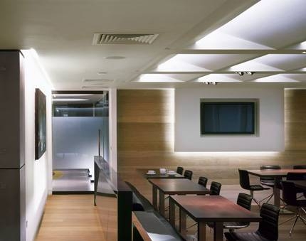                      |


 click on images to enlarge
  typical lighting plan
 reflected ceiling plan